
Aligning Process to Customer
Recently I was teaching a Lean Six Sigma course, talking to students about the purpose behind using statistical analysis in decision-making. I know, it sounds like a riveting exchange of wit, levity, and inspiration. Isn’t every exchange that involves data, evidence, and reason?
Of course not. So, then, what is our purpose? Our mission? Our journey? Simply stated…it is to find direction. Some find themselves at a fork in the road, lick a finger, hold it up to the air and feel the path to the right solution…hoping for the best. Me? No thank you. Been there, done that.
Put a little differently, a major goal of the LSS methodology is to make better business decisions. Better decisions lead to fewer mistakes and better outcomes, for both our customers and our company. I will add that many different LSS tools can help in making better business decisions. This is something we stress at all levels of Lean Six Sigma training, from Yellow Belt up to Master Black Belt.
So – how are decisions made in your organization? Are they made because “someone” knows what to do? How many times has a person in a leadership role reacted to a “bad” day or period of “lack-luster” performance? No answer required…we’ve all seen it, and some of us have done it. Ok. Mike! What’s your point? My point is simple…do we want to respond to feeling? Our gut? No. We don’t. As quality guru Dr. W. Edwards Deming is purported to have said: “In God we trust, all others must bring data!”
All Lean Six Sigma practitioners understand that we rely on data. We rely on facts. We rely on analysis. The challenge for most of us is to get decision-makers – supervisors, managers, and executives – to adopt this same approach. Decision-making through the appropriate use of data analysis.
Take note how I used the word “appropriate”. Always keep in mind that statistical tools are just that – tools to help answer a business question or solve a problem. Some LSS practitioners go overboard in the use of tools. At TMAC we’ve seen some projects where the belt generated dozens of charts and graphs. Most of them weren’t really needed, and hence were not appropriate.
So, Mike, which tool is pretty much always appropriate? You can never go wrong with the ever-powerful control chart. Let’s look at an example:
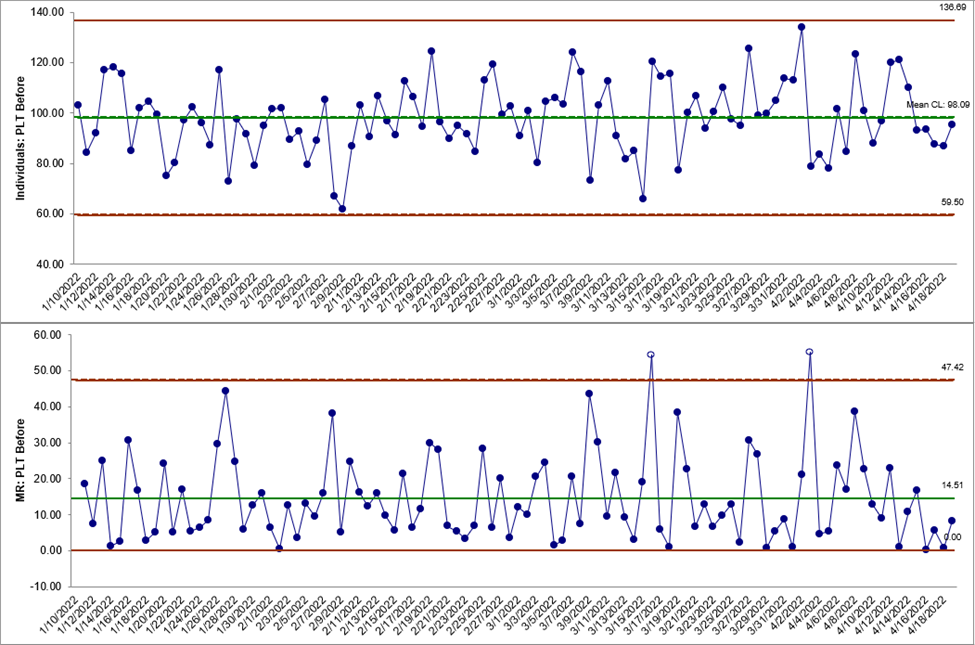
Before we look at anything…what does this chart tell us? It tells us several things. It tells us we have continuous data…things like money, temperature, weight, etc. In this example it is Process Lead Time (PLT).
Secondly, because it is an individual-and-moving range chart or I-MR chart (sometimes called an X-MR chart) we know there are no subgroups. It also tells us this process is out of control. Mike! What? How do you know? Let’s go in.
Control charts, sometimes known as process behavior charts, tell us what the process is doing…how it’s behaving…what is happening. It’s objective. It tells it like it is. It’s the facts as described by the data that are collected.
But out of control? Well, the simple explanation is that all processes exhibit variation. Read that again. All. Processes. Exhibit. Variation. “Mike…not my process!” Yes, your process, too!
It doesn’t matter whether you’re making flower arrangements, firearms, or flight plans. Variation exists. So, let us all band together and panic? No. Let us all band together and understand. And that, my friends, that is how control charts helps us.
Once you know how a control chart is constructed you can then interpret what it’s telling you about the process. Basically, control charts show how a process changes over time by plotting the data points in the sequence they were generated by the process. Superimposed on top of these data points is a horizontal line to indicate the process mean of the collected data and two other horizonal lines – upper and lower control limits. These limits are based on plus or minus three standard deviations above and below the mean. If a data point is found beyond the upper or lower control limits, this indicates the process is out of control. What does this mean? Simply that the process exhibits special cause (Deming preferred assignable cause) variation.
Back to our example with the PLT data. We always start by looking at the bottom chart, in this case the Moving Range (MR) chart. Sure enough, there are two data points above the Upper Control Limit. Yep, this process is out of control. A quick scan of the Individuals Chart, on the other hand, shows it is in control.
What to do? Well, we could go change something to get rid of that variation.
No! Go and understand the variation. Define it. Determine the root cause. Address it! Attack it with vengeance, like Maximus the Gladiator…in this life or the next. Of course, do it in this life…not the next…profit is now.
Now that you want to better understand variation, what are some appropriate tools to help you do this? Glad you asked! I like to start with a good old-fashioned brainstorming session. Another great tool to use: A Fishbone Diagram. Sometimes I’ve seen LSS teams use 5 Whys. Regardless of the tool used, the important thing is to come up with an answer to the question: Why did the process go out of control?
Once you understand the answer to this Why question then you can move on to the What question: What can we do to prevent this out-of-control condition from recurring? Here is the real power of control charts in action.
Keep in mind: Control charts tell us WHEN something happened, but not WHY it happened. By asking the Why question (Why is the process out of control), and then the What question (What can be done to prevent it) you can slowly but surely stabilize a process which will result in better, more consistent products and services.
As LSS practitioners, if we can develop our personnel – and personnel means front line workers, supervisors, managers, and C-level executives – to understand cooperatively that data-driven, fact-based analysis is one of the keys to world-class performance, then we begin a journey where data analysis tells us which way to turn, as well as when to “not react” but to understand a process or performance measure.
Ok, Mike, I get it. Don’t react because of a single negative result.
So – in terms of day-to-day decision-making, what is the value of a control chart? I’ll say its power is in knowing how to distinguish between the expected and unexpected. And in reacting accordingly.
For example, a downward march on some chart may cause a manager to conclude “Stop the presses! We’re in trouble.” However, a little exercised patience and careful study from that same manager could just as well lead her to doing nothing versus making major changes that might not have made a difference anyway. And that would be the right decision.
The bottom line is… let the data tell us what to do. Using control charts connects us with the Voice of the Process (VOP). Once we know how the process is behaving – the VOP – we can then take steps toward alignment with the Voice of the Customer (VOC). After all…isn’t that what we’re searching for…alignment between process and customer?
Stay tuned for a future column on Process Capability, and how it helps measure the degree of alignment between process and customer. Also, how it provides guidance on what to do to improve this alignment.
