
What are the Data Telling Me?
(Yes… “Data” is Plural!)
Dear Lean Six Sigma Readers,
I hope you are having an amazing Spring as I am! This month’s blog is about analyzing data. Have you ever been asked to analyze a dataset? If so, what was your approach? If you are like me, and enjoy discovering the story of the data, you will like this. But, even if you don’t, keep reading, you might find it helpful! Wouldn’t you like to understand trends, patterns, performance, and relationships? In addition, wouldn’t you like to determine if you are experiencing common or uncommon situations? Even at a personal level? Believe me, we all have data in our lives! Expenses of the month, hours of sleep, steps during the day, intake calories, and many others.
Here is the step-by-step approach I use in analyzing a new set of data:
- Formulate Questions
- Get Data
- “Feel” the Data
- Validate the Data
- Visualize the Data
- Review Statistics
- Use Advanced Tools
To illustrate this approach, I’d like to share a specific example. Although we are all probably tired of hearing about COVID related numbers, I thought this was a topic anyone would be familiar with, thus I picked it.
To find a dataset I googled “COVID dataset download” and out of the over 2.4 billion results (as of April 12, 2021 when I started working on the blog), I chose: “Our World in Data.” After some exploration on the webpage, I picked a specific dataset.
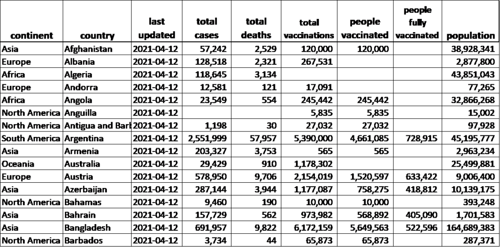
Here is a screenshot of a portion of the data:
Now let’s use the approach outlined above to examine this data.
- Formulate Questions – Good data analysis starts with asking good questions. Do you have specific question(s) you are trying to answer? For a LSS project, this most likely would be the case. Such questions are typically identified in the Define, Measure, and Analyze Phases of the DMAIC. One especially helpful tool in generating good questions is a Stratification Matrix. If you have not determined specific questions, formulate some by doing a quick review of the data (if available).
In my case, I have a lot of columns and could potentially analyze all of them. However, for the purpose of this example, I picked a few variables and formulated these questions:
- What is the total number of cases by continent?
- What is the death rate by continent? And by country?
- How many people are fully vaccinated by continent? By country?
2. Get Data –The ideal situation is to have historical data. However, if this is not the case, then you need to collect new data. Before collecting data, a best practice is to prepare a Data Collection Plan which is a common deliverable in the Measure Phase. The basic information required for such a plan includes what data to collect, sample size, frequency, who, when, and how it is to be collected. In my case, luckily, there are historical data.
3. “Feel” the Data – Get familiar with the data and understand what information you have. Identify the X and Y variables, look at the number of observations, the type of data (quantitative, qualitative), and the timeframe of the data. For my analysis, I decided to focus on several columns with X variables including continent, country, hospital beds per thousand patients, and people fully vaccinated. In terms of Y variables, I chose number of cases and number of deaths. I had a combination of qualitative and quantitative data, with a total of 202 observations (one for each country. Note: the list included few islands). Finally, the data were current as of April 12th of 2021.
4. Validate the Data – This is probably the most critical step – and the most time consuming! Good data drives good business decisions. And the opposite is also true – poor data can lead to poor decisions. This is why having good data is so critical to effective decision-making. To make sure your data are trustworthy, measurement system analysis (MSA) must be performed. The most basic check is to do an audit of the measurement system (audit MSA). This is the bare minimum form of MSA and includes reviewing operational definitions, checking to see how data are collected, when, and by whom. Basically, you want to ensure the same method is followed by everyone collecting data. In some cases, you might need a formal, rigorous MSA which requires either a Gage R&R study (for continuous data) or a Kappa study (for attribute data).
The next step is to do a “reality check” of the data. This begins with a review of the data to look for values that are clearly wrong (e.g., negative time). Then, you should “scrub” the data (remove blank spaces, delete duplicated records, fix typos, etc.). From there you should look for outliers.
Now you are ready to organize data into the desired format for ease of use. Consider splitting data if necessary. In my case I did a “reality check” by comparing values from the dataset to numbers on other websites such as the total cases in the world, total cases in the USA, total deaths in USA and total fully vaccinated people in USA. I was able to confirm the numbers from the dataset were aligned with other sites on the Internet. I eliminated a few countries with no records, then arranged data in a format for analysis.
5. Visualize the Data – You may have heard this before: “The human brain processes images 60,000 times faster than text”. This is exactly why the next step is to use the data to generate some graphs! Different graphs can be used to identify the “shape” (distribution) of the data, make comparisons between groups, check for trends and patterns, show the level of variation, and look for possible relationships. Commonly used graphs include histograms, normality plots, boxplots, control charts, and scatter plots. Here are some of the graphs I generated from my dataset:
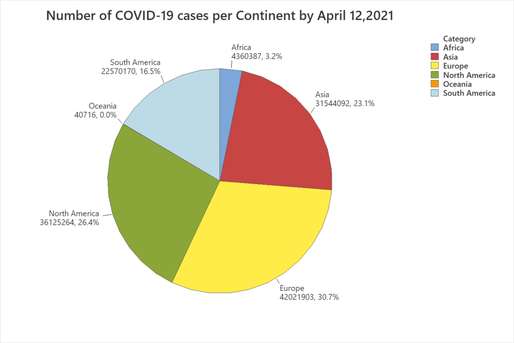
Interpretation: From the pie chart (Figure 1), it can be observed that the continent with the highest number of COVID-19 cases is Europe, representing almost 31% of the cases worldwide, followed by North America with over 26%, and Asia with 23%.
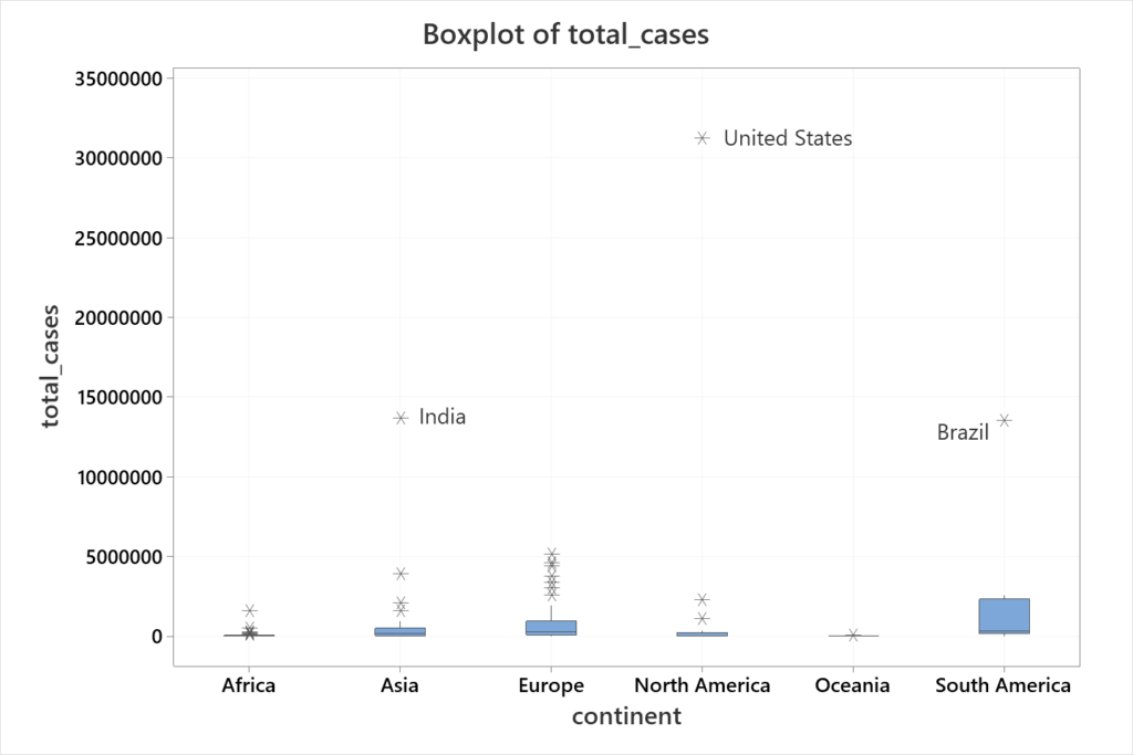
Interpretation: From this graph (Figure 2) we can see that, for example, in Europe there is a significant variation between the number of cases by country. Clearly, some countries have a relatively small number of cases while other countries have a high number of cases. By comparison, the boxplot for Oceania seems to be very consistent, meaning that the number of cases by country is very similar. Of course, the number of countries in those continents might influence this. Several countries are flagged as outliers, with three of them standing out for their respective continents: United States (North America), Brazil (South America), and India (Asia). Finally, Figure 2 makes it clear that the United States is the country with the highest number of cases not only in North America but also in the world.
6. Review Statistics – The next step is to get more specific information about the data through analysis and confirm visual results with numbers! Most of the time graphs provide a better understanding of data. But in other situations, graphs can be misleading. For example, in Figure 2 there appears to be a clear difference in the number of cases between Oceania and South America. But this difference is not that clear between Asia and Europe.
Some of the basic tools for this step include measures of central tendency (mean, median) and variability (range, standard deviation), quartiles, p-values, and capability measures (Cpk, Ppk). For my study, I decided to create a summary (Table 1) of the number of cases by continent – including the total deaths and the death ratio – to expand the information provided in Figure 1. I also decided to look closely at Europe, so I created a histogram along with descriptive statistics (Figure 2). Finally, to continue the analysis of these data, I created Table 2, with more information about United States, India and Brazil.
| Continent | Total Cases | Total Deaths | Death Ratio |
| Africa | 4,360,387 | 115,974 | 2.66% |
| Asia | 31,544,092 | 450,736 | 1.43% |
| Europe | 42,021,903 | 956,604 | 2.28% |
| North America | 36,125,264 | 824,460 | 2.28% |
| Oceania | 40,716 | 1,007 | 2.47% |
| South America | 22,570,170 | 596,866 | 2.64% |
| Total | 136,662,532 | 2,945,647 | 2.16% |
Interpretation: Some of the conclusions that can be drawn from Table 1 is that the total number of cases by April 12, of 2021 surpassed 136 million, from which 2.16% of all those infected have died. The continent with the highest number of cases is Europe (42 million) but the continent with the highest death ratio is Africa (2.66%) which is essentially tied with South America (2.64%). Asia has the smallest death ratio with 1.43%.
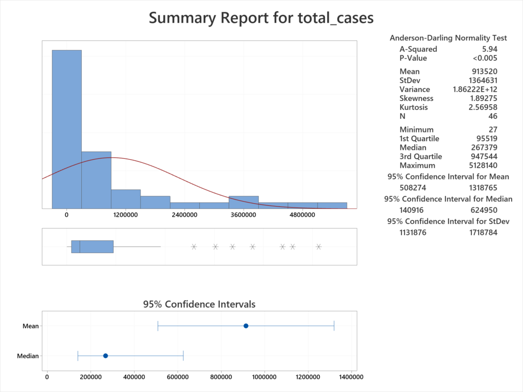
Interpretation: From Figure 3, the median number of cases for countries in Europe is 267,379. In other words, half the countries have less than this number and half have more cases. The mean is much higher, at 913,520. This figure is greatly skewed by the countries with a much higher case load. For example, one country has over 5 million cases. Digging into the data shows this to be France. On the other extreme, the country with the fewest number of cases is the Vatican, with only 27 cases.
| Country | Population | Total Cases | % (Total Cases/ Population) | Total Deaths | % (Total Deaths/ Total Cases) | People Fully Vaccinated | % (People Fully Vaccinated / Population) |
| United States | 331,002,647 | 31,268,107 | 9.45% | 562,533 | 1.80% | 74,066,085 | 22.4% |
| India | 1,380,004,385 | 13,689,453 | 0.99% | 171,058 | 1.25% | 13,490,046 | 1.0% |
| Brazil | 212,559,409 | 13,517,808 | 6.36% | 354,617 | 2.62% | 6,352,371 | 3.0% |
Interpretation: Based on Table 2, as of April 12, of 2021, 9.45% of the Unites States population have been infected with COVID-19 and 1.8% of the cases have resulted in death. Over 74 million people have been fully vaccinated, which represents about 22% of the population. In India, the total cases compared to the population is almost 1%. However, only 1% of the population have been vaccinated. Brazil has the highest death rate (2.62%). The sum of the total cases for United States, India and Brazil represents almost 43% of the cases in the world.
7. Use Advanced Tools – The use of advanced statistical tools can be used to answer more complicated questions, such as whether a relationship exists between variables. This question can be answered using tools like correlation, and regression analysis. Questions as to whether two or more processes have the same underlying parameters (such as the population mean or proportion defective) can be answered through hypothesis testing. A very commonly used hypothesis test is the 2-sample t-test which is used to determine whether there is a significant difference between two population means.
To show this step for my analysis, I ran Welch’s ANOVA [for more on ANOVA see www.texasleansixsigma.com/anova-for-all-occasions/]. This allowed me to compare the means of the number of cases per country on each continent.

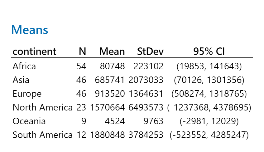
Interpretation: In this analysis the N represents the number of countries per continent and the mean is the average number of people who tested positive, per country. It can be observed that the sample means are quite different from each other. Based on the ANOVA output (Figure 4), we can conclude there is a statistically significant difference between the population mean number of cases per continent. In other words, we reject the null hypothesis which is that the population means are the same.
Finally, I decided to see if a relationship exists between the number of hospital beds available per thousand people and the death rate due to COVID. I did a scatter plot, followed by linear regression.
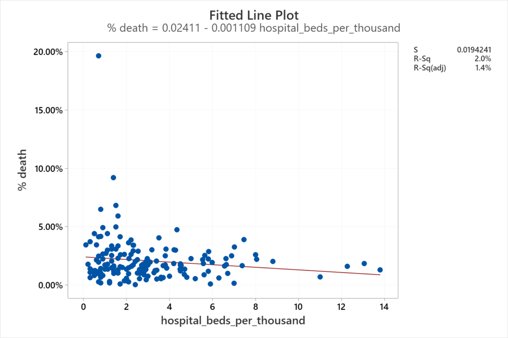
Interpretation: It might make sense to think that the lower the availability of beds, the higher the death rate. However, based on the information from 161 countries, there is no evidence of a strong relationship between these two variables. For some countries, it might be true that fewer beds lead to a higher percentage of deaths, but this does not hold true for all countries. Additionally, the coefficient of determination is very poor (R-sq = 2.0%) for a fitted line.
This document also contains additional tips to help you with the analysis. Hope you enjoy it! And good luck in your data analysis!
